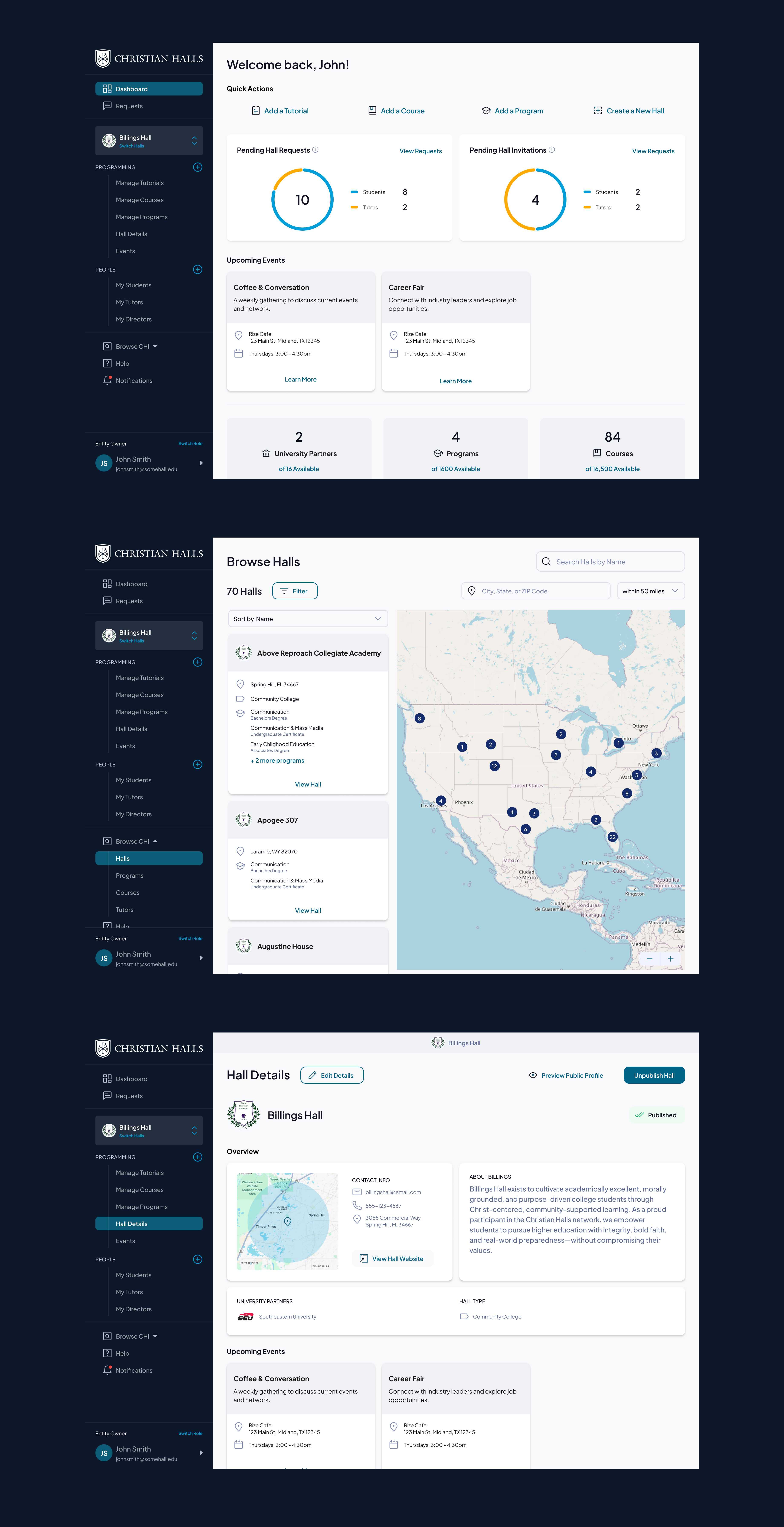
Christian Halls International -MyHalls Platform

UX Research, Product Strategy, UX Design, UI Design
Project Overview
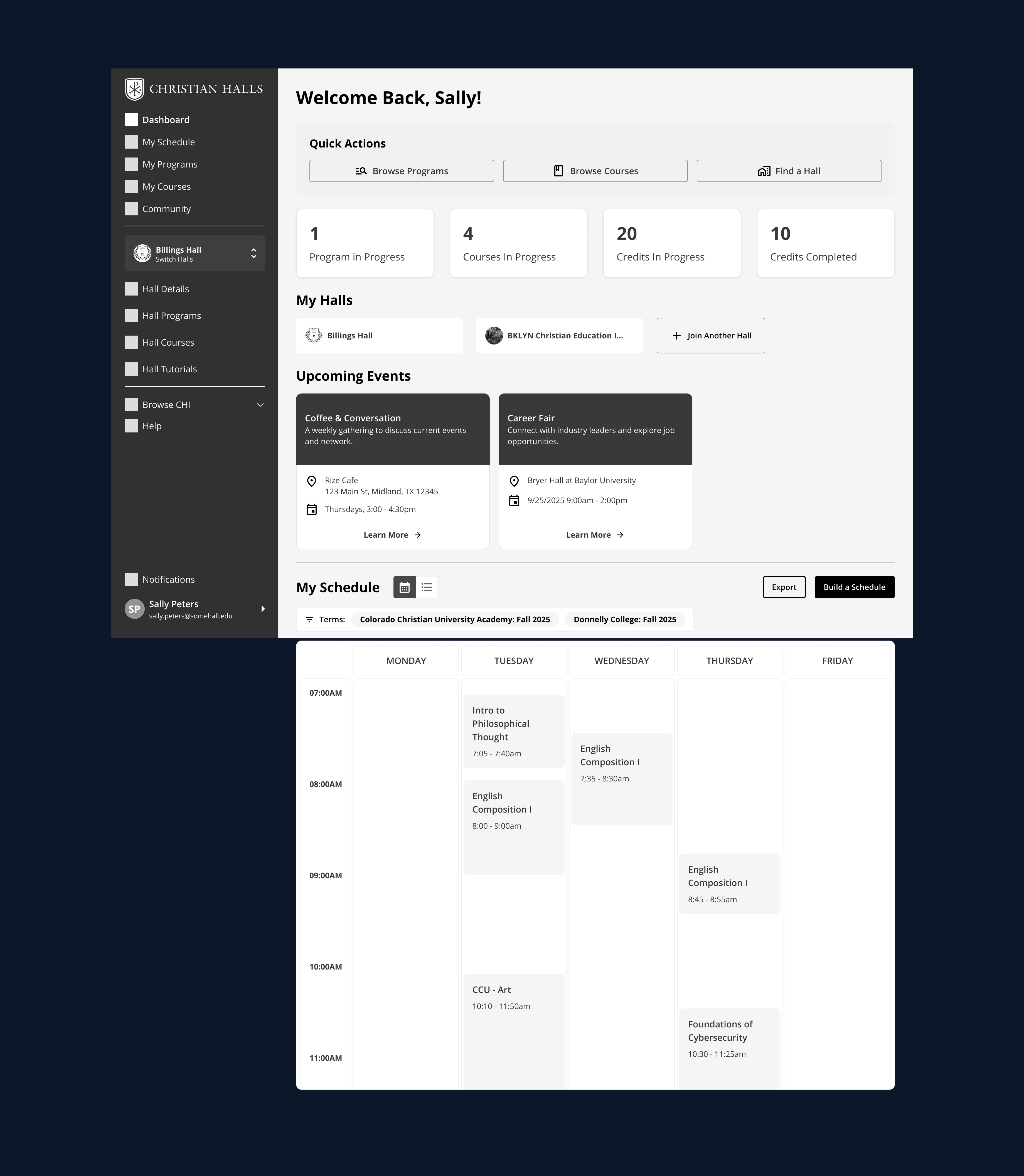
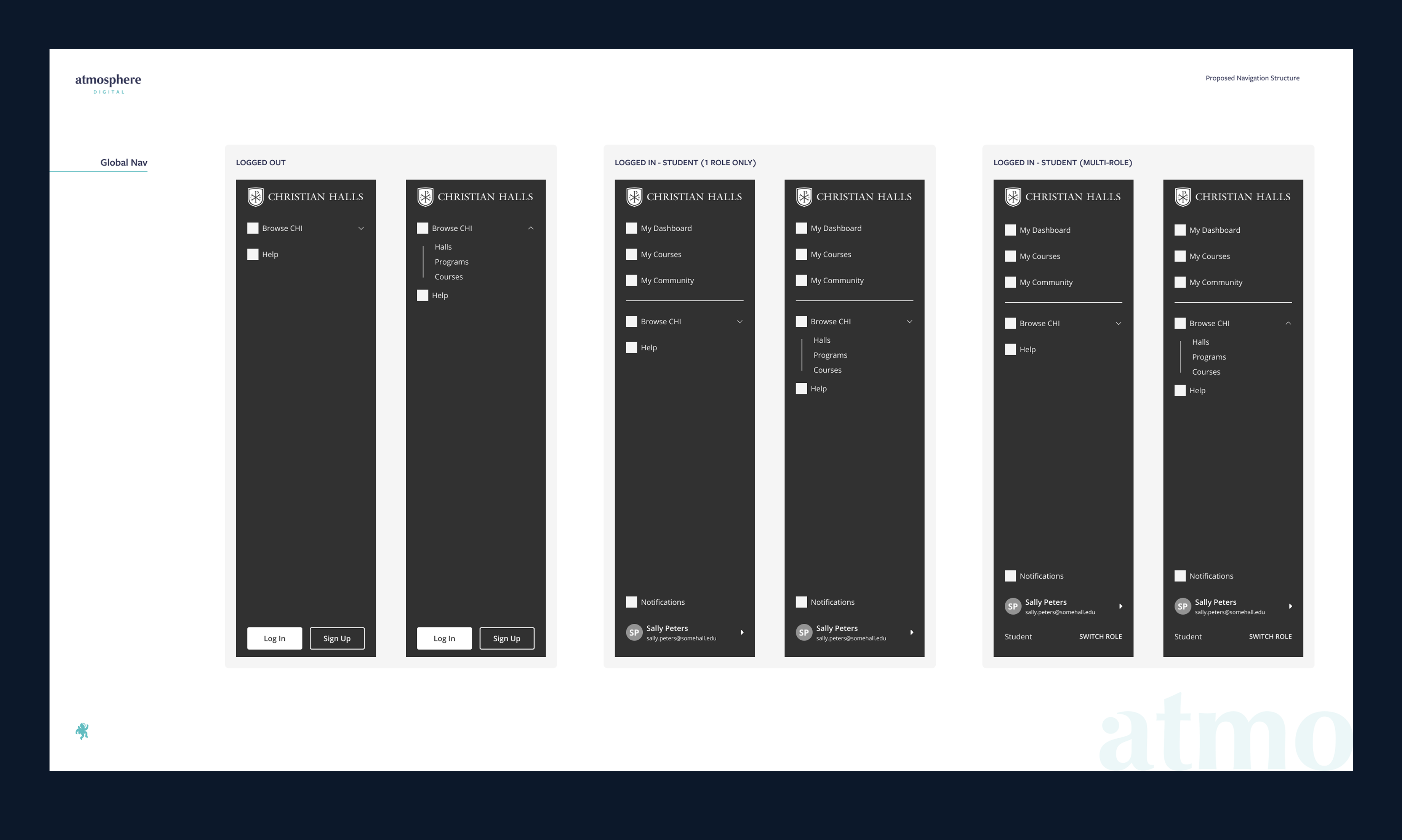
MyHall is a web platform created for Christian Halls International (CHI) to support the operations of local educational halls and tutorial-based learning communities. The platform serves multiple user types, including students, tutors, hall directors, field representatives, and academic administrators, through both a public-facing portal and a back-office management system.

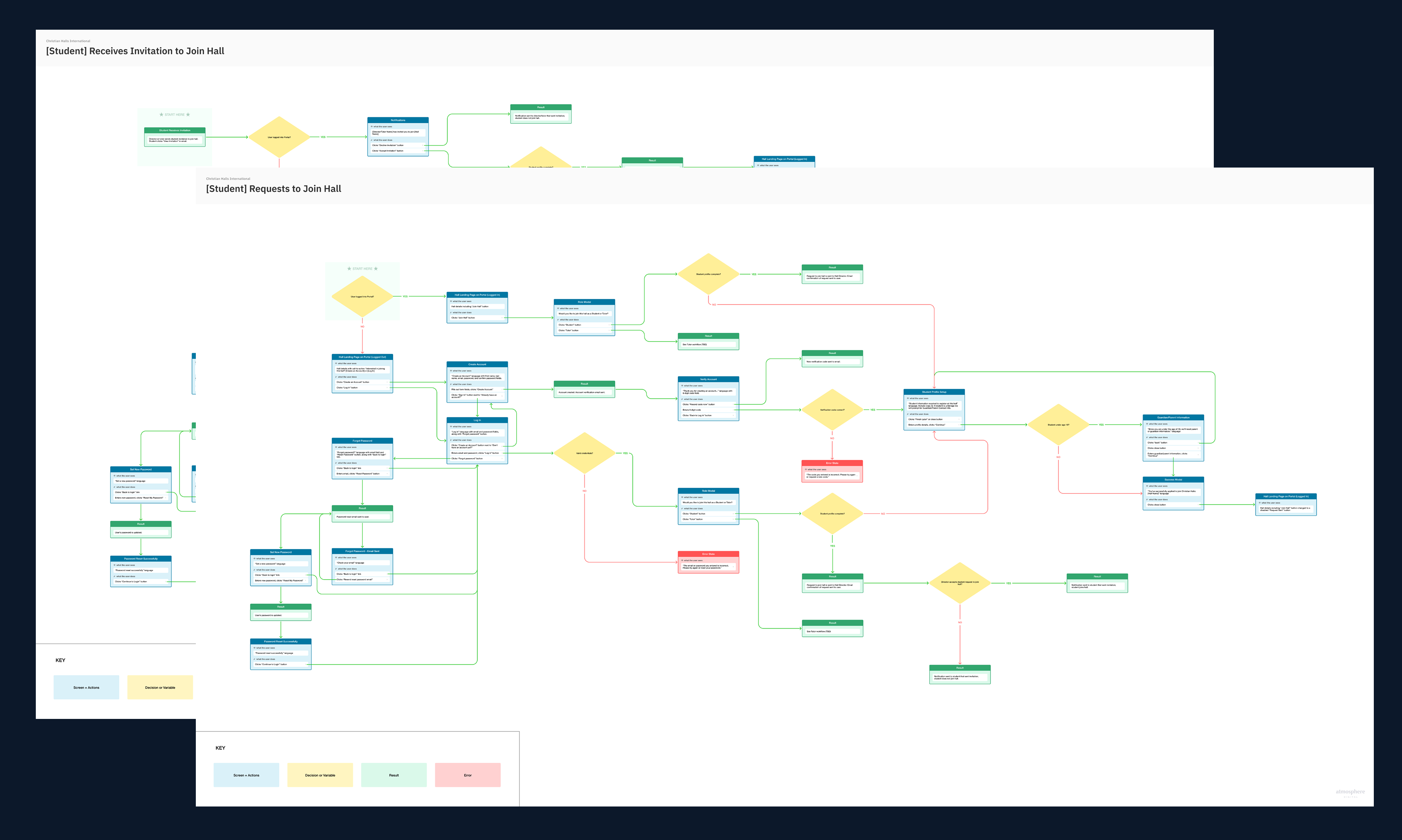
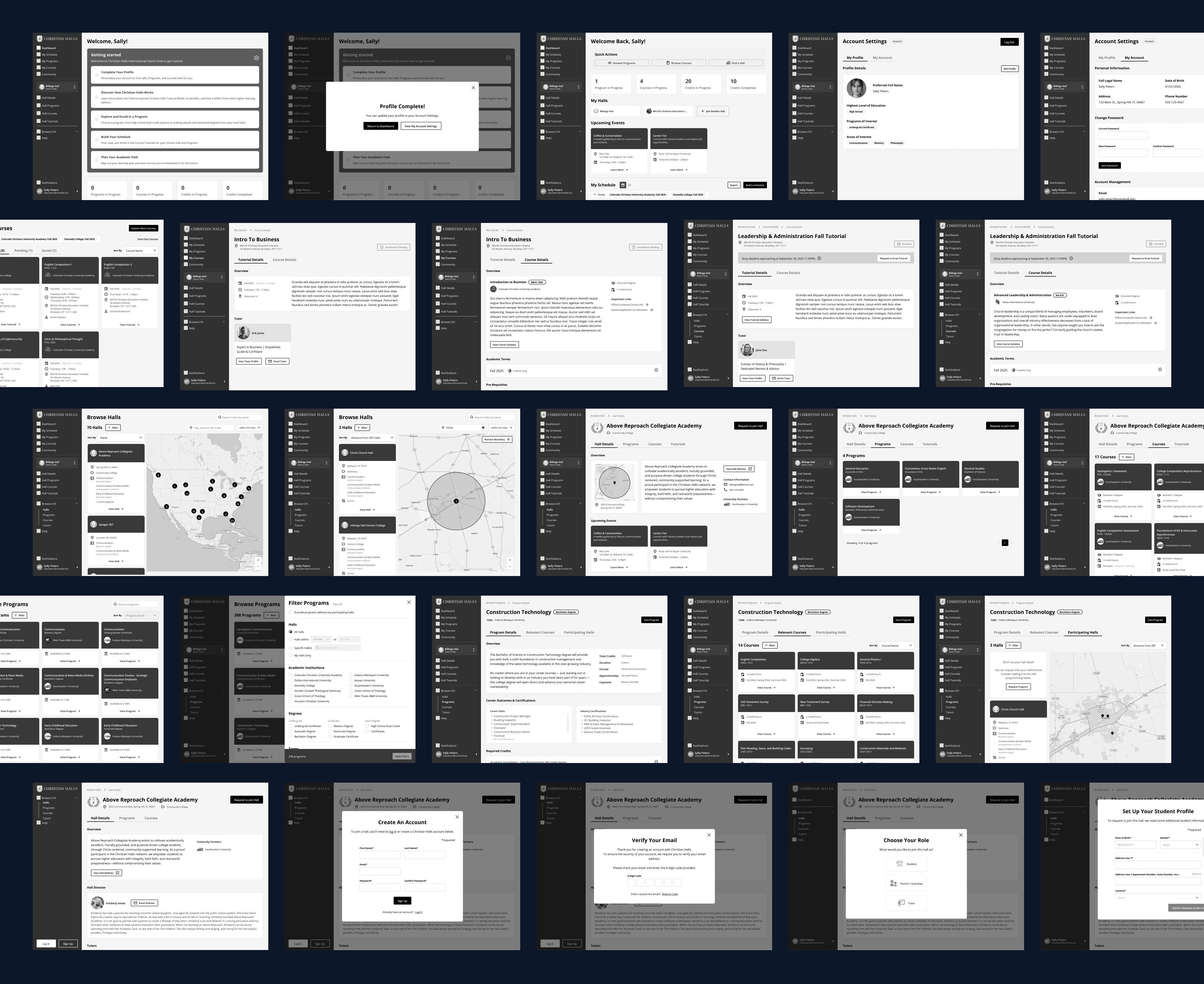
The existing experience had become increasingly difficult to manage and navigate as the platform expanded. Key workflows, such as account creation, course visibility management, tutorial enrollment, and scheduling, required significant user guidance and operational support. Students primarily logged into the platform only when absolutely necessary, and directors relied heavily on manual processes and tutorial videos to manage hall operations.

The redesign initiative focused on transforming MyHall into a more intuitive, scalable, and self-service platform that could act as the single source of truth for hall operations and educational engagement.
Key goals included:
  • Reduce friction and confusion for students, tutors, and hall directors
  • Create a clearer visual and functional metaphor for how a hall operates
  • Minimize the need for high-touch onboarding and tutorial videos
  • Simplify hall and course management workflows
  • Improve navigation, scheduling, and discoverability across the platform
  • Establish a scalable foundation for future growth, including white-labeled experiences and enhanced student progress tracking
My Contributions
As the Lead UX Designer, I helped shape the vision, structure, and user experience for Christian Halls International’s MyHall platform redesign. My role focused on simplifying complex educational and administrative workflows across students, tutors, directors, and administrators to create a more intuitive and scalable platform experience.
Key areas of contribution included:
  • Discovery & Insight Development: Collaborated with stakeholders to identify operational pain points, onboarding friction, scheduling challenges, and navigation gaps across multiple user roles.
  • UX Strategy & Definition: Helped define a clearer platform structure centered around self-service workflows, simplified hall management, and improved educational navigation patterns.
  • User Flows & Information Architecture: Designed role-based navigation, enrollment flows, scheduling workflows, and clearer relationships between halls, programs, tutorials, and courses.
  • Wireframes & Prototypes: Created responsive wireframes and interactive prototypes for dashboards, hall discovery, enrollment, scheduling, onboarding, and administrative management experiences.
  • UI Design: Designed a modernized interface system focused on usability, visual clarity, scalability, and reducing complexity across the platform.

Deeper Dive: My Process

Understanding Operational Complexity
The platform supported a wide range of users with different permissions, goals, and workflows. I began by mapping:
  • User roles and hierarchy structures
  • Enrollment and scheduling workflows
  • Hall operational management tasks
One of the key discoveries was that the platform lacked a strong conceptual model. Users struggled to understand:
  • What a hall represented
  • How tutorials differenced from university courses
  • How programs bundled tutorials together
  • What actions were available to them based on their role
This ambiguity contributed heavily to onboarding friction and operational inefficiency.
Simplifying the Experience Architecture
Flows, Wireframes, & Prototypes
I restructured the navigation and overall IA around clearer mental models and user intent.

Key UX improvements included:
  • Surfacing "Browse Halls" globally
  • Separating enrolled vs. discoverable experiences
  • Introducing clearer scheduling visibility
  • Clarifying tutorial/course/program relationships
  • Making hall discovery more map and search driven
A major emphasis was placed on making the experience feel:
  • Less administrative
  • More intuitive
  • More visually digestible
  • Clarifying tutorial/course/program relationships
  • Easier to self-navigate without external support
Proposed Navigation
Shorthand Flow
Designing Around Real User Tasks
The wireframes and UI explorations focused heavily on:
  • Surfacing "Browse Halls" globally
  • Separating enrolled vs. discoverable experiences
  • Introducing clearer scheduling visibility
  • Clarifying tutorial/course/program relationships
  • Making hall discovery more map and search driven
I explored multiple interaction models for:
  • Map-based browsing
  • Filter systems
  • Dashboard summaries
  • Role-based navigation
  • Program and tutorial visibility
The resulting designs emphasized:
  • Faster comprehension
  • Better information hierarchy
  • Reduced friction for repeat tasks
  • More confidence in completing workflows independently
Portion of the Wireframes Created
Outcome
The redesign established a significantly more intuitive and scalable foundation for the MyHall platform.

The updated experience:
  • Reduced copmlexity across user journeys
  • Created clearer relationships between halls, tutorials, programs, and courses
  • Improved discoverability and enrollment workflows
  • Modernized the platform visually and structurally
  • Reduced reliance on high-touch support and tutorial documentation
  • Positioned the platform for future enhancements like student progress tracking, white-label support, and university data integrations
The final designs provided Christian Halls International with a cohesive UX framework capable of supporting both current operational needs and future platform growth.
The Final Product