PT Compact

UX Research, Product Strategy, UX Design, Usability Testing
Project Overview
The Physical Therapy Compact (PT Compact) is a multi-state agreement that allows licensed physical therapists to easily practice across state lines. Instead of applying for a new license in each state (a process that can take weeks) therapists can obtain a Compact Privilege in minutes.

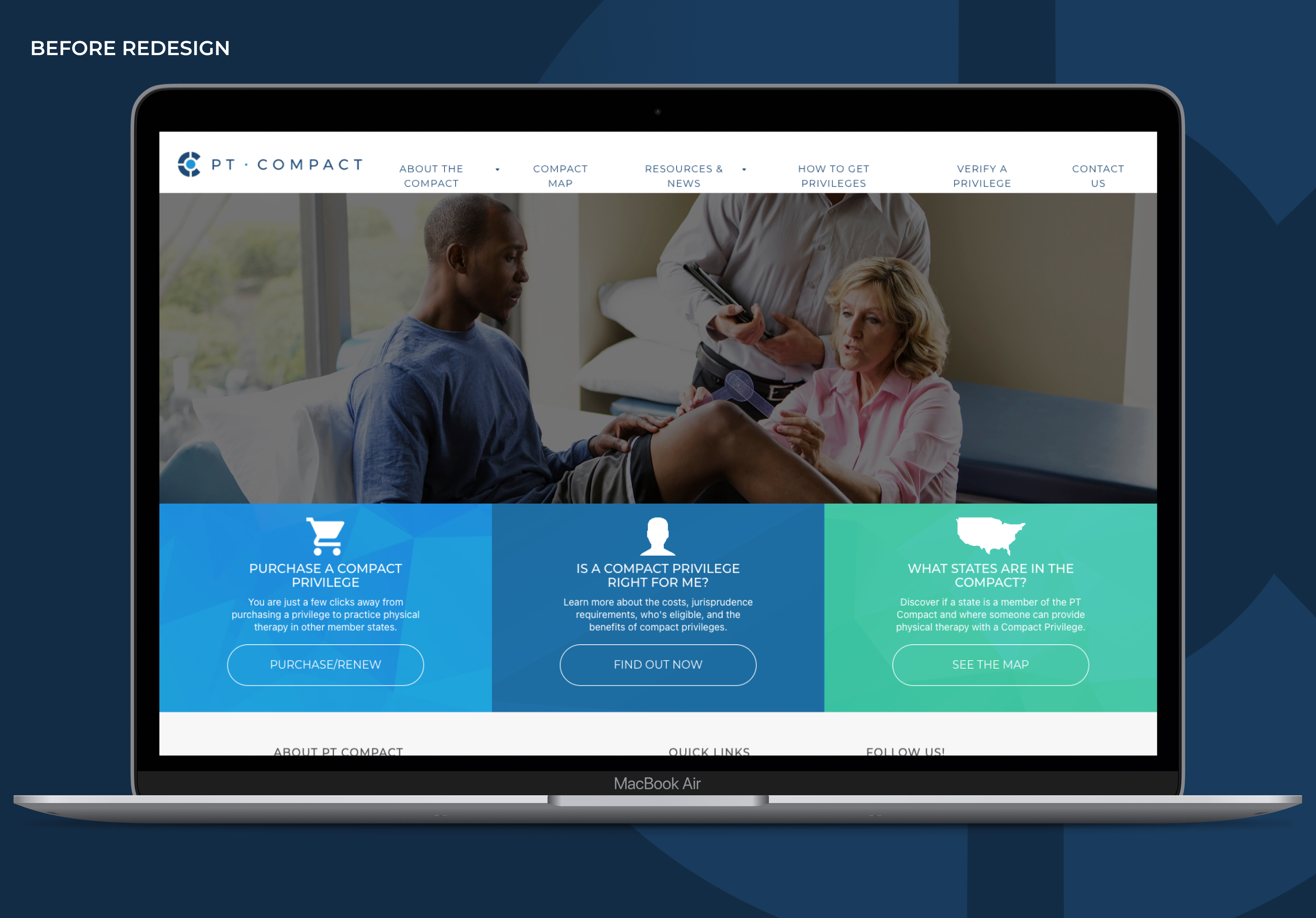
Historically, the PT Compact’s website served more as a regulatory hub than a customer-focused experience. It housed essential governance information (like meeting minutes, board details, and documentation) but lacked clarity, structure, and user-centered design for its growing base of physical therapists seeking Compact privileges.

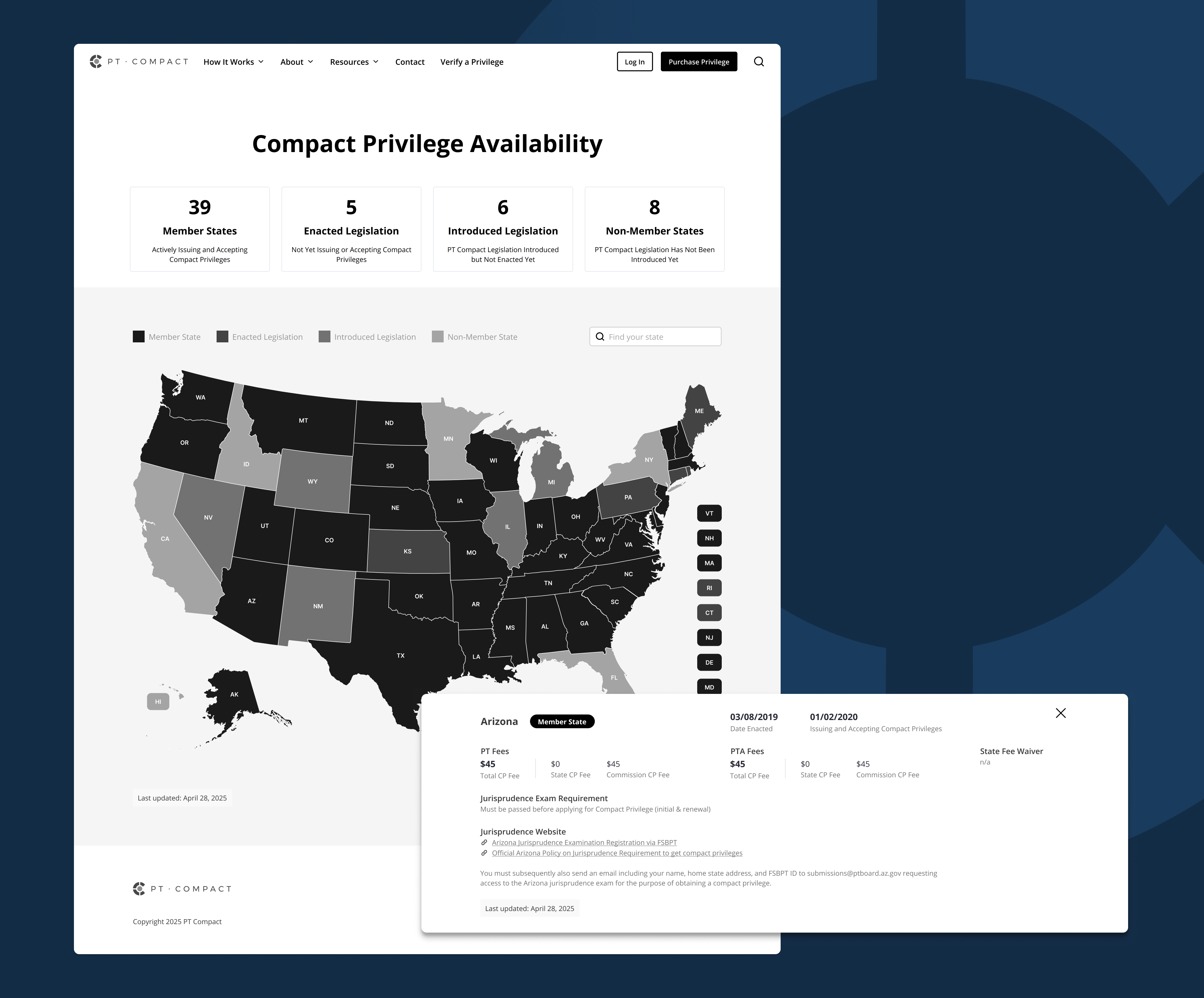
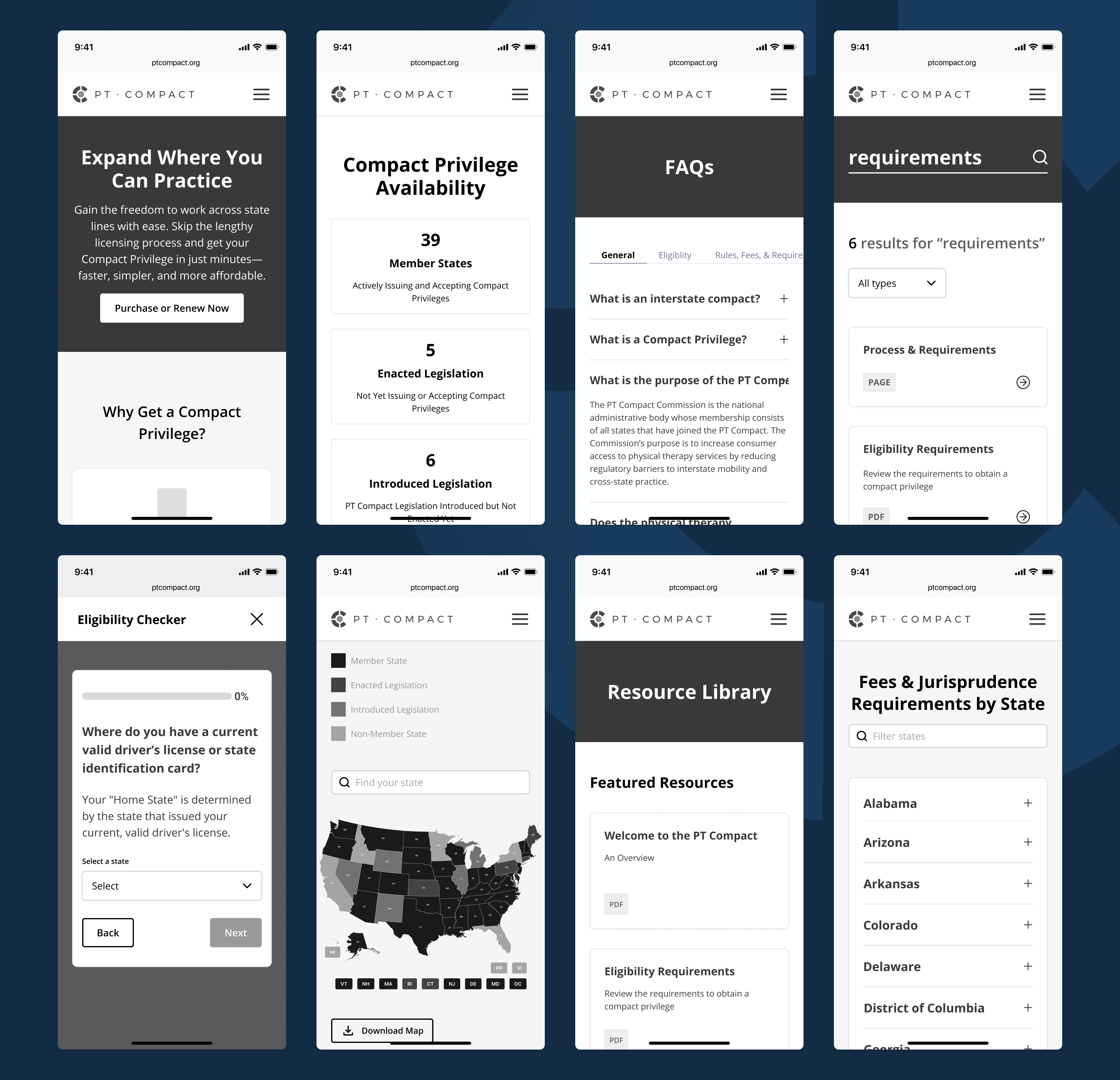
The result was a confusing, text-heavy site that left users uncertain where to start and why the Compact mattered. Key features like an interactive map, FAQs, and eligibility guidance were either buried or missing entirely. Meanwhile, the lack of search functionality and limited CMS control created daily operational friction for administrators.

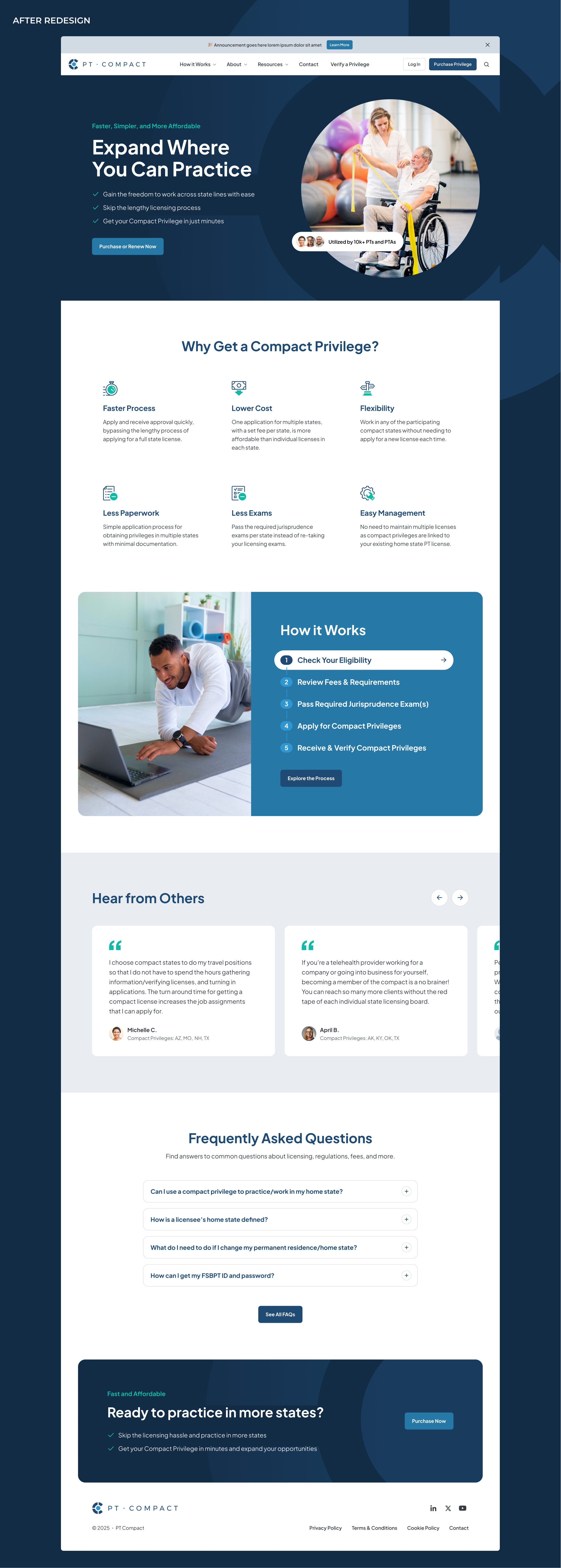
The redesign initiative aimed to reimagine PT Compact as a streamlined, trustworthy, and self-service resource; one that clearly communicates value, simplifies decision-making, and reduces administrative overhead.
My Contributions
As the Lead UX Designer and Information Architect, I led the experience strategy and early design for the PT Compact website redesign. My focus was on transforming a regulatory information hub into a clean, intuitive, and empowering user experience.
Key deliverables included:
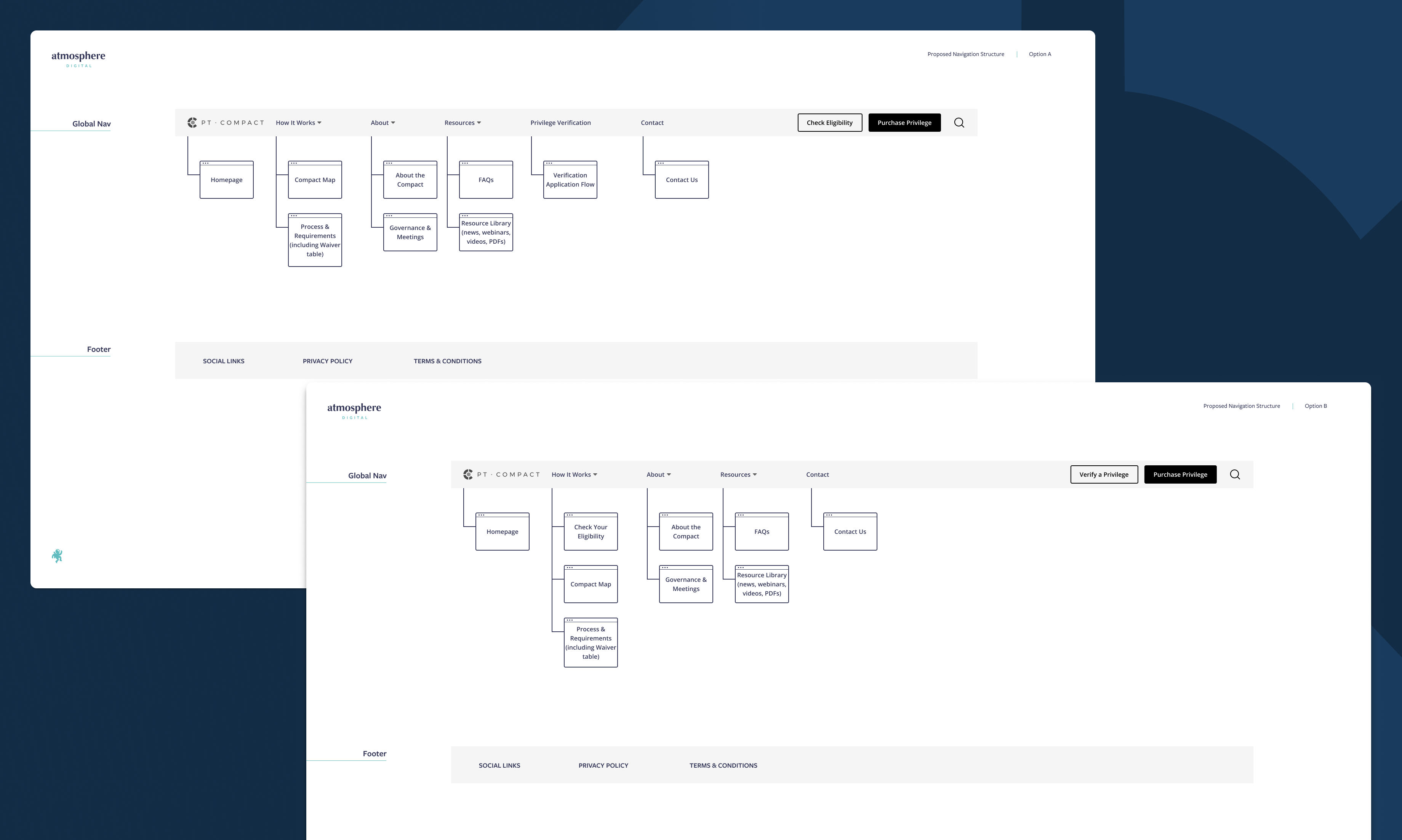
  • Proposed Navigation Structure: Defined a clear, user-centered global navigation system to surface essential content (FAQs, map, eligibility guidance, meetings, governance) while de-prioritizing dense policy text.
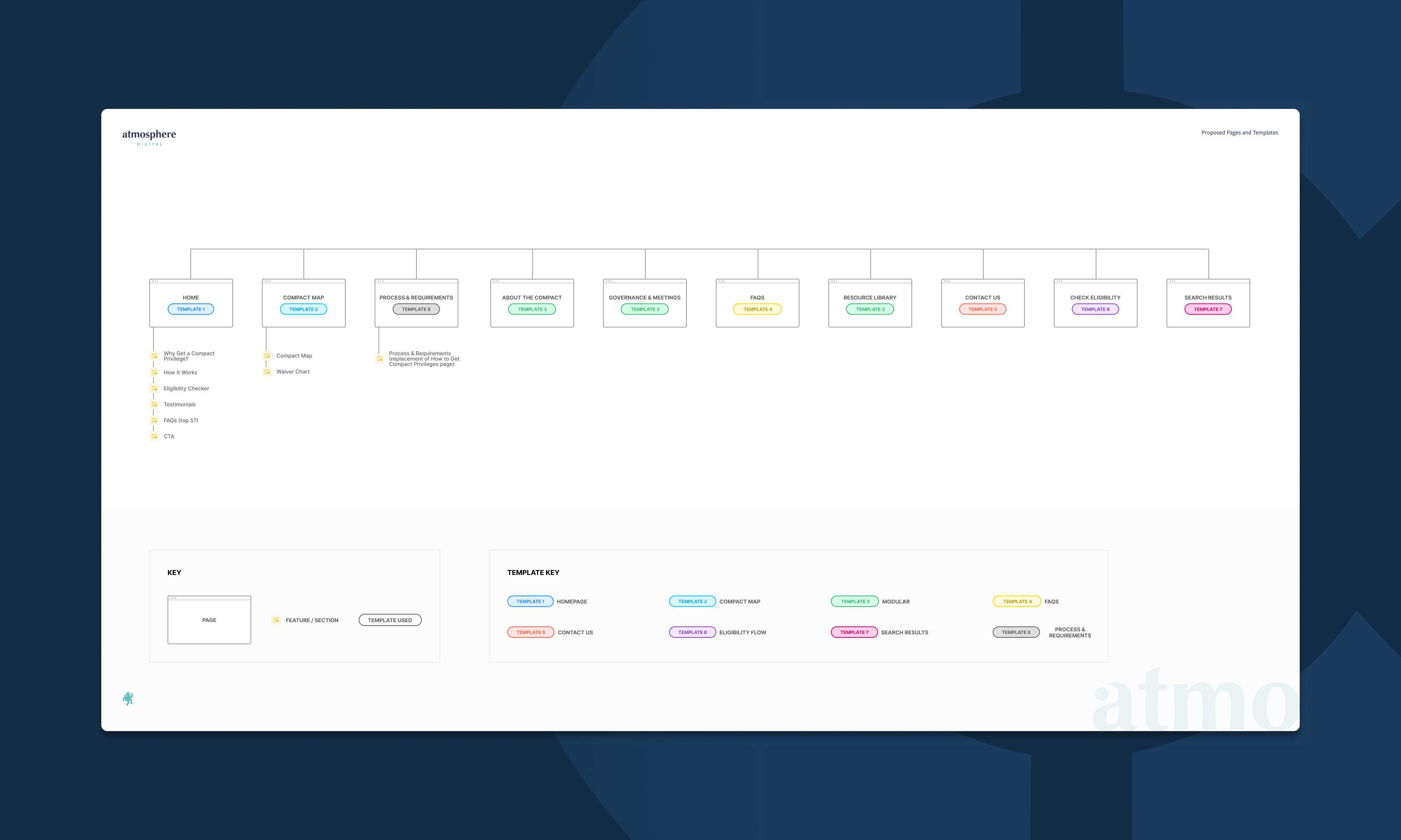
  • Site Map: Mapped and restructured all pages to support both primary users (physical therapists seeking privileges) and secondary users (board members and staff).
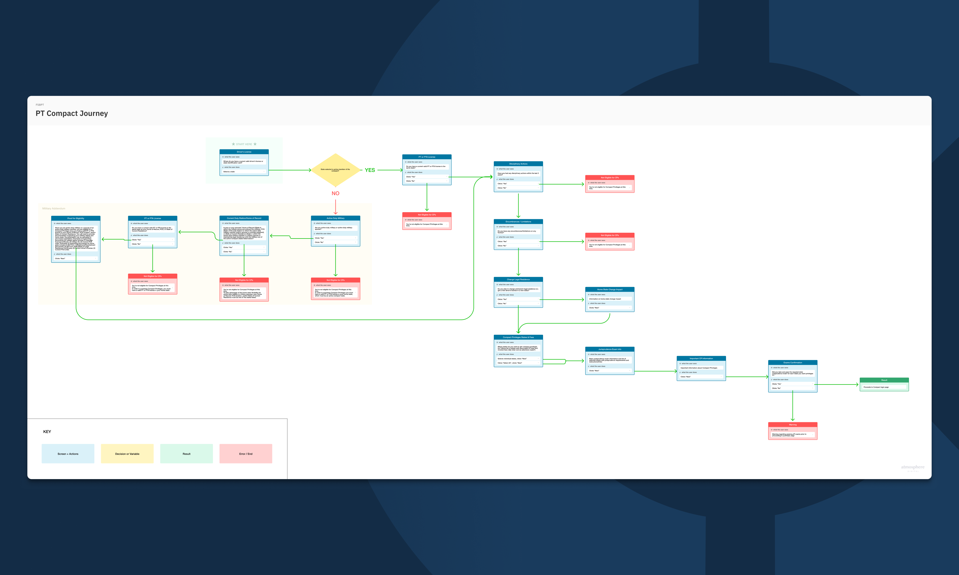
  • Shorthand Flows: Outlined core task flows for seeking privileges, checking eligibility, and comparing options between compact privileges and traditional licensure.
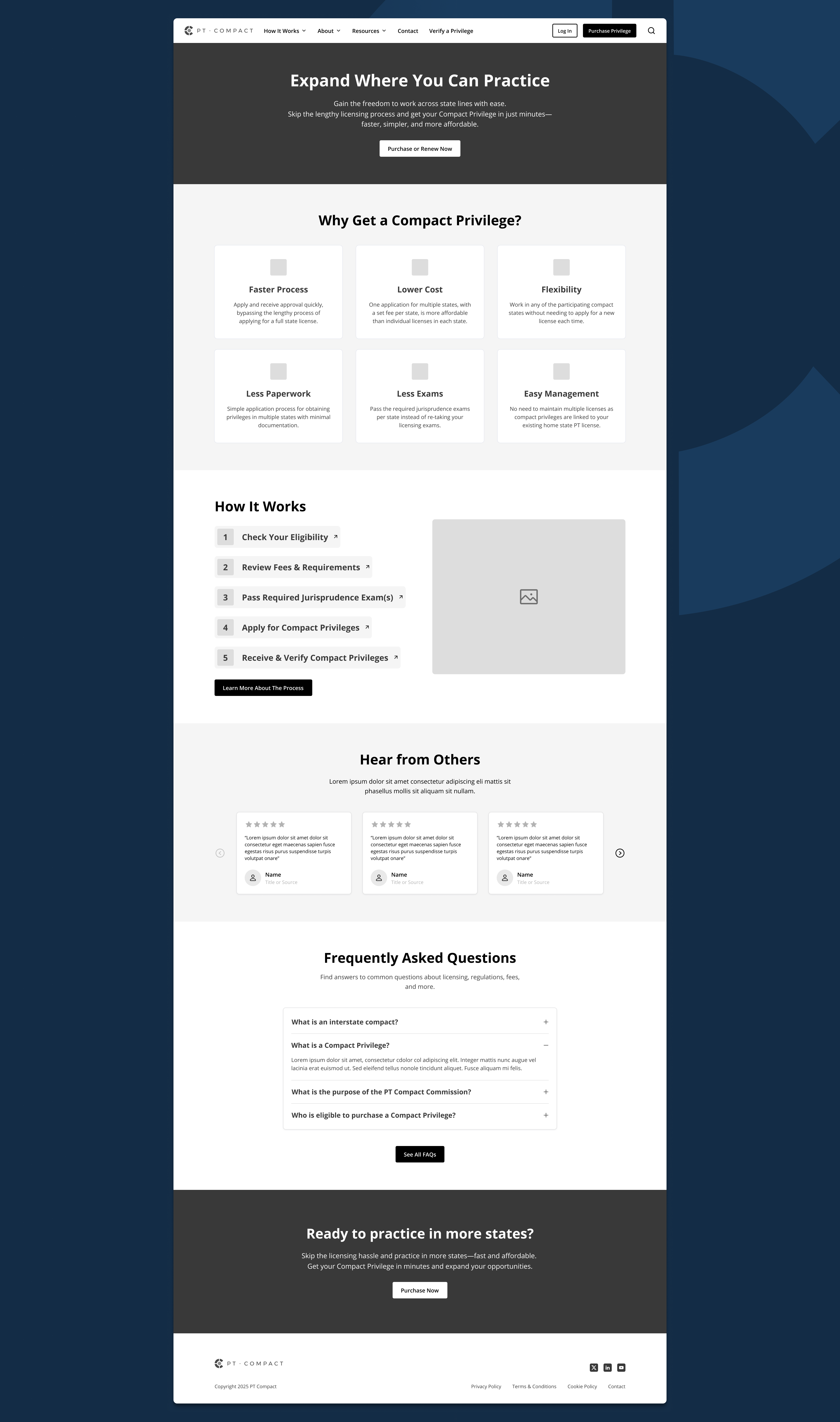
  • Wireframes & Interactive Prototype: Created low- and mid-fidelity wireframes and an interactive prototype exploring new page layouts, content hierarchy, and a redesigned homepage emphasizing simplicity, clarity, and visual appeal.

Deeper Dive: My Process

Understanding the Challenge
Through discovery sessions with PT Compact's leadership, I identified key pain points:
  • User confusion: Visitors couldn’t easily find where to begin or how to determine eligibility.
  • Operational inefficiency: Frequent user emails (≈20 per day) indicated the site wasn’t answering common questions.
  • Outdated structure: The existing site lacked a search function and required developer intervention for simple content updates.
From these insights, we defined the guiding design goals:
  • Make cross-state practice feel effortless.
  • Communicate speed and simplicity.
  • Empower users through self-service content.
  • Support staff autonomy and reduce email volume.
Proposed Navigation Structure Options
Structuring the Experience
I re-envisioned the information architecture around user intent and decision points:
  • “Why PT Compact?” section: Clearly communicates benefits such as speed, reduced red tape, and simplicity.
  • Eligibility & Guidance Tools: Proposed an interactive decision aid (“Should I Get a Compact Privilege or a License?”) to help users determine the right path.
  • Interactive Map: Replaced static content with a functional map (inspired by state bar and nurse compact examples) for real-time state participation and requirements.
  • Global Search: Introduced a robust search feature to reduce friction and help users locate documents, FAQs, or policies instantly.
  • Simplified Governance Section: Retained meeting minutes and board documentation but made them more accessible through filtered, well-labeled pages.
Site & Template Mapping
Shorthand Flow
Designing for Clarity and Action
Through wireframes and prototypes, I explored a visually clean and modular layout emphasizing:
  • Scannable content: Key stats, visual icons, and short blurbs replacing long paragraphs.
  • Guided pathways: Primary calls to action like “Check Eligibility,” “Apply for a Compact Privilege,” and “See Participating States.”
  • Interactive Map: Replaced static content with a functional map (inspired by state bar and nurse compact examples) for real-time state participation and requirements.
  • CMS flexibility: Recommended a content management approach enabling the PT Compact team to easily make text or document updates without developer dependency.
These design directions were validated through stakeholder reviews as well as Maze usability testing, focusing on clarity, tone, and alignment with organizational needs.
Homepage Wireframe
Compact Map Wireframe
Additional Wireframes
Mobile Wireframes
Outcome
The resulting UX foundation repositions PT Compact as both a modern public resource and a customer-focused service. By simplifying content, improving navigation, and introducing interactive tools, the redesigned experience is poised to:
  • Reduce administrative email volume.
  • Improve user understanding and engagement.
  • Communicate the Compact’s value through simplicity and design clarity.
  • Empower staff to maintain the site independently.
The Final Product (UI designed by Angie May)